150/365 Make Tufte Proud

I’ve been sitting on this for a few weeks, unsure as to whether or not I’d publicize it. I’ve decided to go ahead because cool stuff is cool, and you like to play.

If you’ve seen any of Hans Rosling’s TED talks, then you’ve likely thought to yourself, “I’d like to make something like that.”

Well, it turns out you can. The folks over at Density Design have put together a fairly seamless infographic tool called Raw that is as easy as copying and pasting data and then throwing a few switches.

The price? Free. Well, it’s free if you don’t count opening the gates to bad design the same way Google Forms made everything look like a form was the perfect hammer.

Anyway, watch the video below, and give it a try. What uses can you find for it? What about your students?

Raw – Basic Tutorial from DensityDesign on Vimeo.

31/365 Three Infographics You Should See (plus one more)

Infographics are fun, right? I mean, who doesn’t like their data with a side of pictures?

The three here (plus one more) have been open tabs in my browser for weeks now. While I question some of their findings and methods, it’s in those questions that I see the opportunity to a deeper conversation about the work we’re doing, whose doing it, and why.

1. The (Australian) Achievement Gap

via Nancy Rubin, developed by Open Colleges

While focusing on the Australian perspective, this graphic strikes me as interesting to deploy into a classroom where (U.S.) students are investigating other cultures and attempting to make sense of charts/graphs.

2. Teachers Embrace Digital Resources to Propel Learning

via Josie, developed by PBS Learning Media

While the use of pie charts is questionable, dropping this graphic at the top of a faculty meeting or using it to start the development of a school or district tech plan could generate some great conversation. Of particular interest: How is what we see here reflected in our own learning space? What do we see that we want to know more about?

3. The Social Media Cheat Sheet

via Alex Shevrin, developed by Flowtown

Alex shared this in our ongoing conversation in our Antioch University New EnglandP2PU course on social media in education (come join), and I love it. I’ll be using it whenever I get the chance to talk to teachers about affordances and constraints of social tools in the classroom. If I were teaching right now, it’d also be a starter for a class conversation about how we could build things in class that were useful and connected to the outside world. Love it.

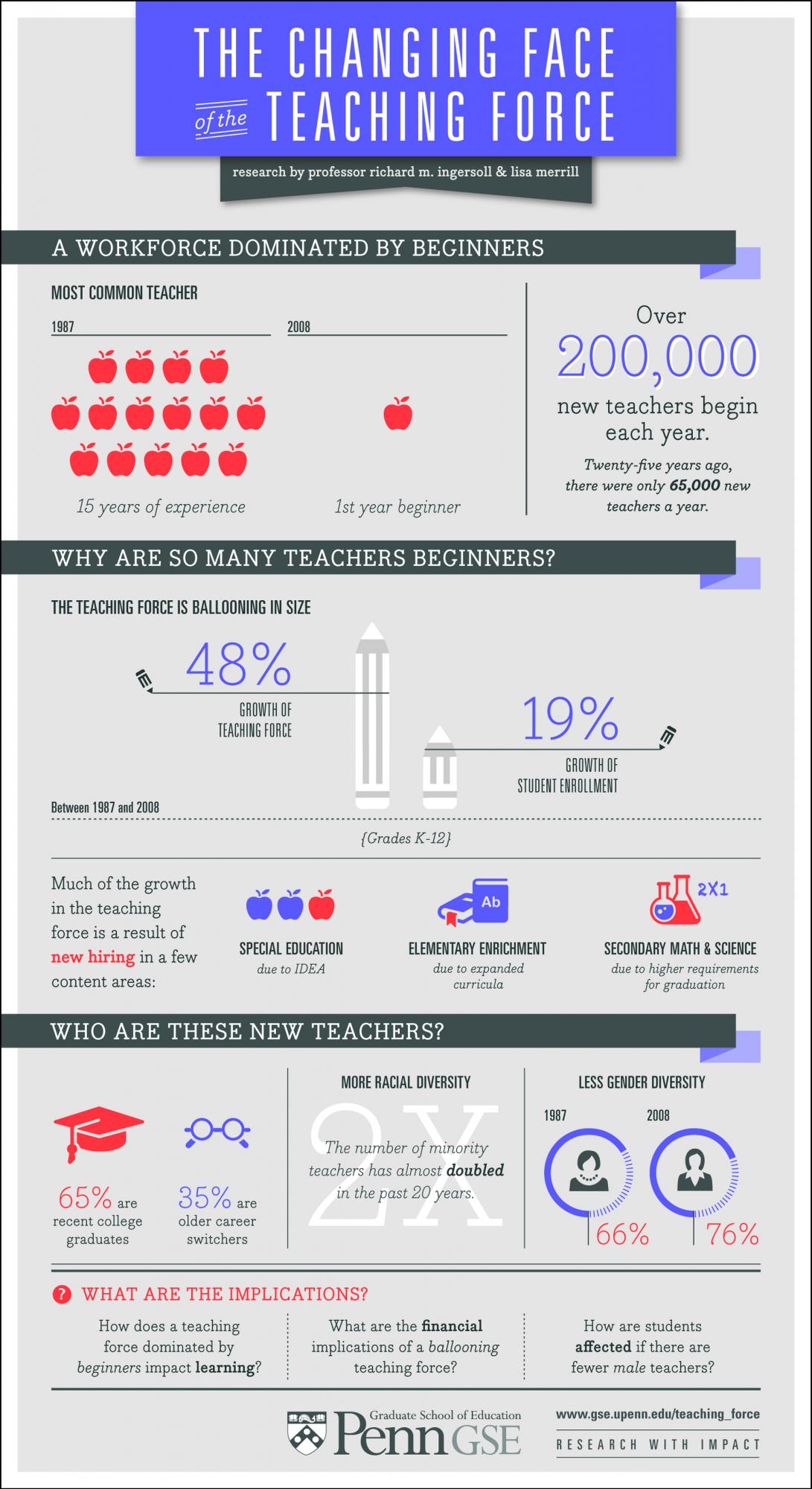
4. The Changing Face of the Teaching Force (I promised one more)

via Penn GSE, developed by Richard Ingersoll

One of the conversations I keep coming back to as I work with student teachers is, “What will your impact be in the classroom?” If you’re guessing I’ll be pulling in this graphic for one of our future seminars, then you are correct. Ingersoll’s work is presented in a provocative and consumable way, and I’ve had many conversations about what the shifts he highlights might mean for the shifting picture of the students in those classrooms as well. If I were working in a district HR office, this would be how I started thinking about hiring practices or examining what we already have in place.

Things I Know 246 of 365: I’m deciding to learn something new

True genius resides in the capacity for evaluation of uncertain, hazardous, and conflicting information.

– Winston Churchill

In my first weeks at SLA, I got a little terrified. I inherited my classroom midway through the first quarter. By the time I’d started thinking about getting my bearings another teacher approached me, “What are you planning for your benchmark this quarter?”
For what was the fiftieth time since joining the school, my heart stopped.
I had no idea.
I talked to Chris. It was a moment of intellectual cardiopulmonary resuscitation.
Essays, he explained, could be projects.
I breathed again.
I can do essays. They are the coin of the realm for the bulk of schooling. Whether you believe the 5-paragraph essay is the devil or the first step to clean livin’, schools find ways to get kids writing essays. Take a look at standardized test scores and you won’t be able to turn around without bumping into a schools whose writing scores outpace reading, math and science.
I’ve got three major essays in the offing here at school. This is on top of the weekly essay assignments for two classes. Add to those the daily postings here, and I start to feel like the essay king.
It’s ok. Essays are my sport.
So, I’ve decided to take up a new sport – one I appreciate watching, but have no idea how to play.
I’m going to learn to create data visualizations.
In google reader, my “Infographics” folder is my favorite.
I’ve been quietly building my collection of resources in delicious.
After I complete my next two essays, I’m starting. Seriously.
As many people better versed in the visualization of data have written, information and making sense of it are the coins of the realm for the modern age.
This realization is my secondary drive. Most of all, I’m curious. It’s the same things that led me to open up and dissect every telephone I could get my hands on as a little kid. It’s what prompted me to mix rain water, onion grass and other things I found in my yard and leave them in the garage to see what happened.
I’m curious about something I don’t know. So, I’m learning a new sport.

This is better than writing a paper

The Gist:

  • Thinking about texts is complicated.
  • The ideas of success and greatness are fluid and subjective.
  • Rather than a paper, I’m having my students document their thinking.

The Whole Story:

This piece of work won’t end in a paper. If you’re a traditionalist English teacher-type, you should abandon hope.

In Storytelling as of late, we’ve been working with short stories.

Three questions have held our focus:

  1. What makes a short story?
  2. What makes a great short story?
  3. What makes a successful short story?

With the consideration of each question, the students have been keeping lists qualifiers they identify as we work through some classic and contemporary examples. The other day, they received this assignment:

Today, you’re working to create a flow chart I can apply to any text and correctly end at one of the five following conclusions:

  • Not a short story.
  • Short story, neither great nor successful.
  • Short story, great, not successful.
  • Short story, not great, successful.
  • Short story, great and successful.

To create your flow chart, use one of these five tools:

Once you’ve completed your flow chart, post the link to the final published chart here.

Admittedly, “correctly” in the opening sentence was subjective, but it took the kids to some interesting places.

Hannah created this.

Narayan and Jarmel created this.

Jesse did this.

Patrick did this.

And, Levon did this.

When everyone’s chart was submitted today, the students beta tested:

Pick a flow chart here.

Plug in 5 different texts:

  • Not a short story.
  • Short story, neither great nor successful.
  • Short story, great, not successful.
  • Short story, not great, successful.
  • Short story, great and successful.

Keep track of where it comes out. Take notes of where you got lost or where you needed more direction. Pass your notes on to the flow cartographer as a reply in the forum.

Repeat for two more charts.

Not only did it lead to some interesting informal discussions of what constituted “great” or “successful,” it pushed students to revise and iterate their process for arriving at these conclusions.

I won’t be assigning a paper at the end of this. I don’t need to. Writing a paper no one will care about is not the skill I want them working toward. They’ve shown me their thinking in a way that is more accessible than they’ve be able to in a collection of paragraphs analyzing one or two chosen texts.

This, I can interact with.