In a recent class, a colleague was describing the Chicano civil rights movement here in Colorado. As she detailed the events, she ended with, “…and then it went nationwide.”
I paused for a moment. Why hadn’t I heard about this movement when I was growing up in Central Illinois? Had it truly gone nationwide?
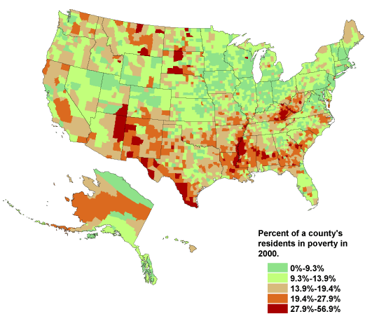
Then I got curious as to what the Hispanic population looked like by the numbers near my hometown. I’d several friends who identified as Hispanic when I lived in Florida, but couldn’t remember any from my time in Illinois. I took to the Internet. Here’s what I found:
 It seemed from this picture that I had a reason why the movement going nationwide hadn’t resonated as profoundly in the Midwest. This got me curious. Here’s what else I found:
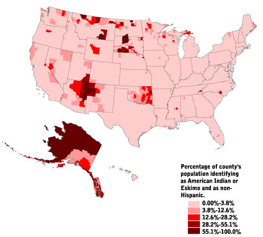
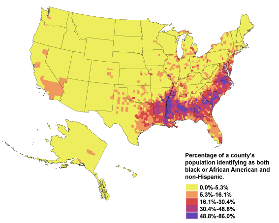
 And…
And…
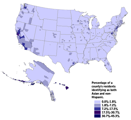
 And…
And…
 These were things I could probably have described generally if handed a blank map and asked to color in the distribution. It wasn’t until I started considering these maps with regard to the “national” conversations we have about race, ethnicity, and culture I’ve witnessed and participated in as I’ve moved around the country. Some things I’m thinking:
- While general patterns of cultural dominance and oppression appear regularly across the map, the cultures in question, how they interact, and how they shift those patterns is vastly different.
- A person with limited geographic mobility living in any of these spaces of greater density of the ethnicities reported above is likely to live with a skewed perception of race in America and limited access to people of other backgrounds, thereby limiting the fulfillment of Allport’s Contact Hypothesis.
- When we talk about race in America, we’re all having different conversations and are rarely aware of those differences.
- Integration, equity, and civil rights are going to require varied approaches if we are to find that “more perfect union” we talk about so much.
If I were in a social studies classroom, I’d be building a unit around these maps and the questions they raise for my students and me. If I were in an English classroom, I’d be asking how these distributions might influence my selection of texts and how I approached helping students access them. If I were leading a school, I’d open a faculty meeting with these images and ask how they might help us think about how we are preparing students for the larger world and their citizenship in it.
And, I’d throw one more map into the mix to make it interesting…